Mild: how a recipe app became a food label scanner
Mobile app design case study: Mild, a food scanner app that compares products by ingredients, scans barcodes, translates food labels and suggests recipes.
Taras Migulko · Product Designer & Product Owner
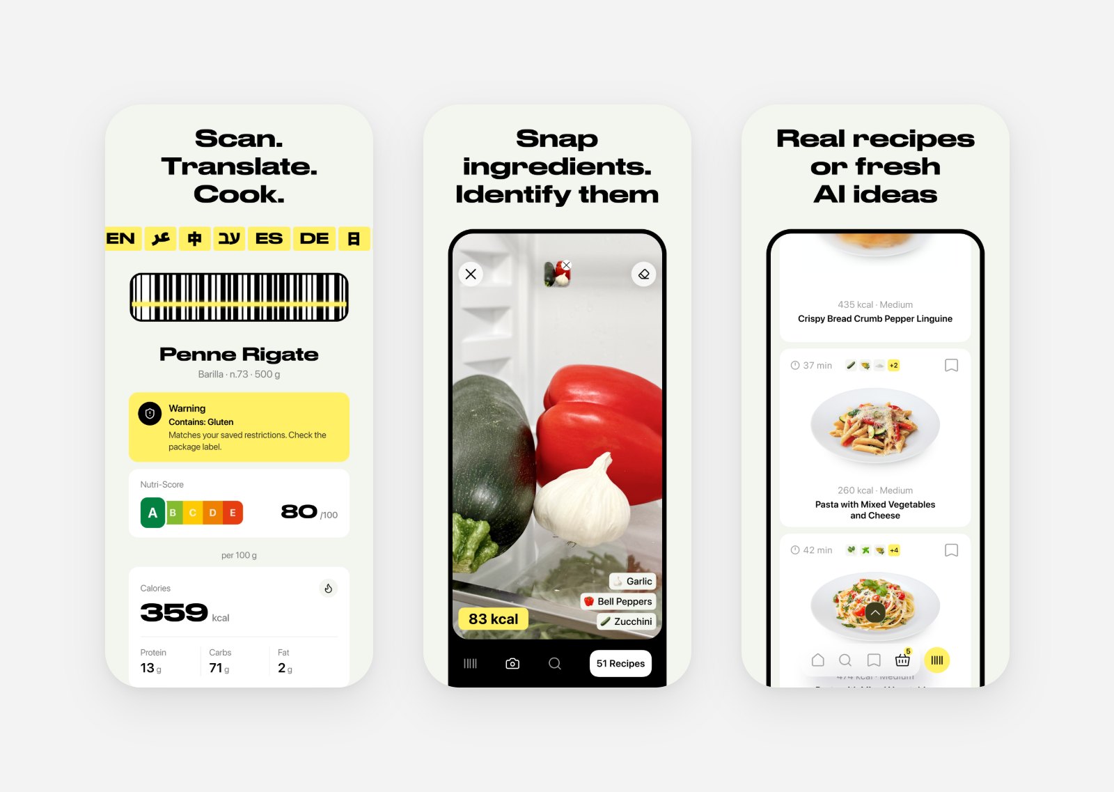
Mild started as a recipe app. You photograph what is in your fridge, the app recognises the ingredients and suggests what to cook. Today the store calls it "MILD: Scan & Translate", and the first line of the listing is about labels: any label, any language. This mobile app design case study is the story of how a food scanner app changed its own name while I was designing it: from a recipe app to a barcode scanner that compares food products by ingredients and translates food labels. As the product designer and product owner, here is what I would keep from the process.
The first idea: a recipe app to cook with what you have
The original promise fit in one screen: take a photo, get dishes you can make right now. The App Store screenshot from July said it plainly: "Now you can cook with what you already have, instead of throwing it out." Food waste was the reason behind it, and the flow was short enough to explain to anyone in a sentence.
A promise that short is a gift for a designer. Every screen either moves the person from the photo to a dish, or it waits for version two.
What Mild does: compare food by ingredients, scan and translate labels
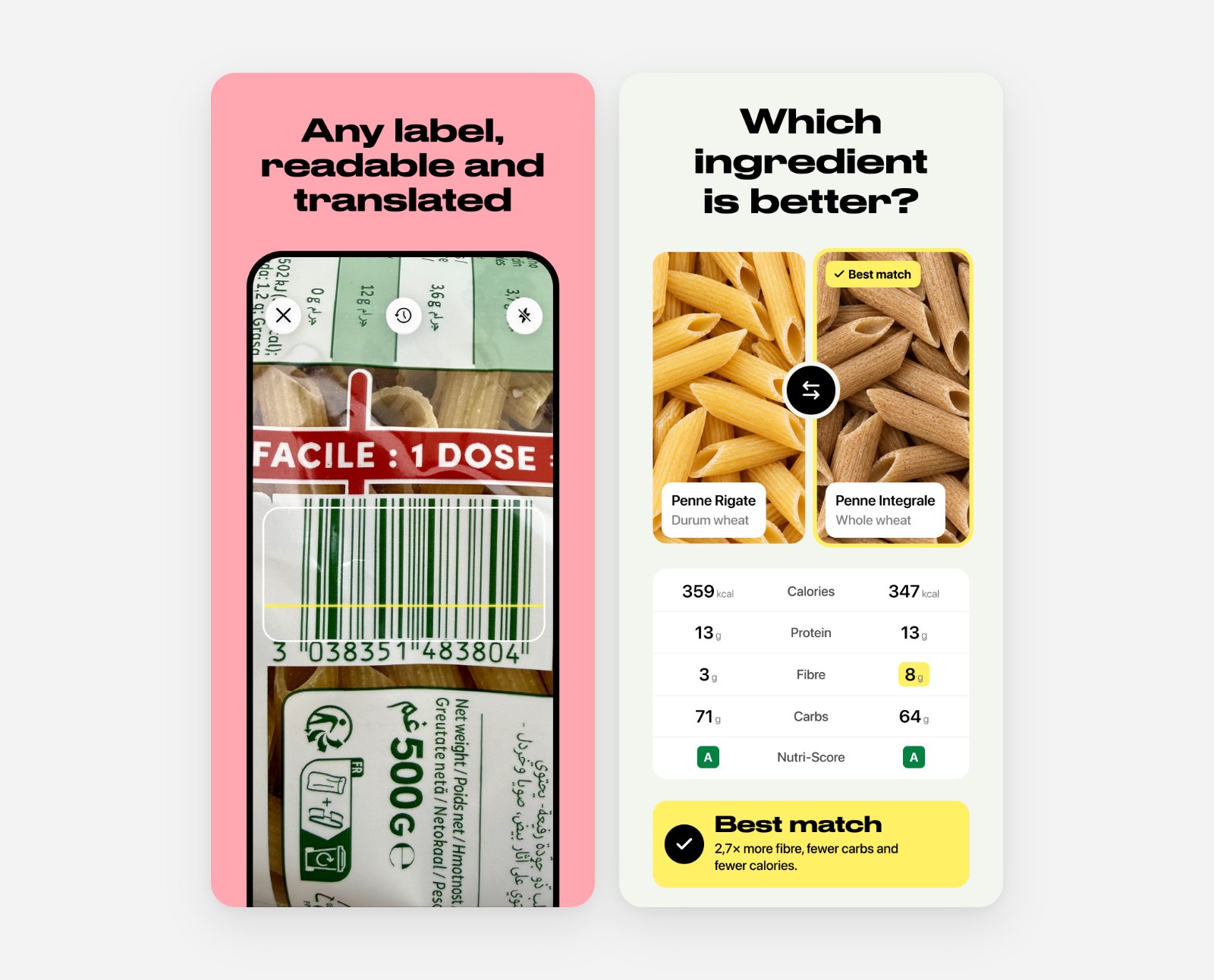
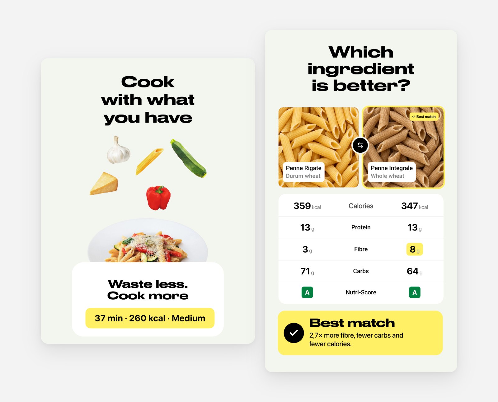
Compare products by their ingredients. This ingredient comparison is the feature I care about most. You stand at a shelf with two jars of pasta sauce or three yoghurts and want to know which one is better for you. In Mild you scan their barcodes one after another, select the ones you are holding and tap Compare. The app names a winner every time, and shows a table with calories, protein, sugar, fat, salt and Nutri-Score side by side, with carbs, saturated fat, fibre and energy one tap away.
The winner rule is simple on purpose, so you can trust it:
The best Nutri-Score letter wins.
On a tie, the product that is equal or better on every nutrient wins, compared on the same 100 g or 100 ml basis.
If it is still a tie, the one with fewer calories wins.
Under the winner the app says why in plain words, for example "Lowest calories, sugar and salt". The products come from a database of about four million items that also works offline, and each one keeps its ingredients and allergens.
When I compared this with Yuka, the best-known food scanner, the difference was clear. Yuka scores one product at a time and suggests alternatives from its database, which are often not in the store you are standing in. Mild compares the products you actually have in your basket.
Food label scanner and translator, and the Compare screen that compares two products by ingredients and Nutri-Score
Read any label in your language. Point the camera at the packaging and Mild reads the ingredients and allergens and translates them. Useful abroad and with imported food.
Cook with what you have. Photograph your ingredients, Mild recognises them and suggests recipes: real ones and fresh AI ideas, with time, calories and difficulty on every card.
Three platforms in one month: why the iOS app went native
The backend and web app came first, in 2025, built with a small team. The mobile app took longer to find its form. In April and May 2026 it went through three foundations: a web wrapper (Capacitor), then Flutter, then native Swift. The repository still has the tags for each attempt.
I do not regret the detours, but the lesson is clear. A camera-first app lives or dies on how fast the camera opens and how the result feels in the hand. Cross-platform shells were fine for forms and lists and wrong for that moment. In July we started a clean native iOS project, and from then on the work was about the product instead of the framework.
A mobile design system that stays out of the way
The visual language is small on purpose:
Druk Wide for headlines, because a food app should feel loud and confident on a store page.
Inter for everything you actually read.
One yellow, #FFF066, for actions, and a warm off-white, #F4F5F0, for the background.
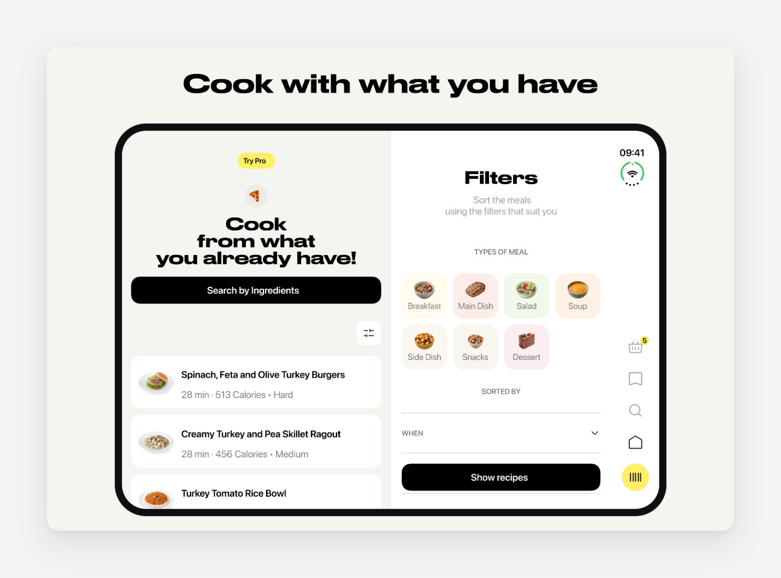
Mild food scanner app on a two-pane layout: the scan result and recipe filters
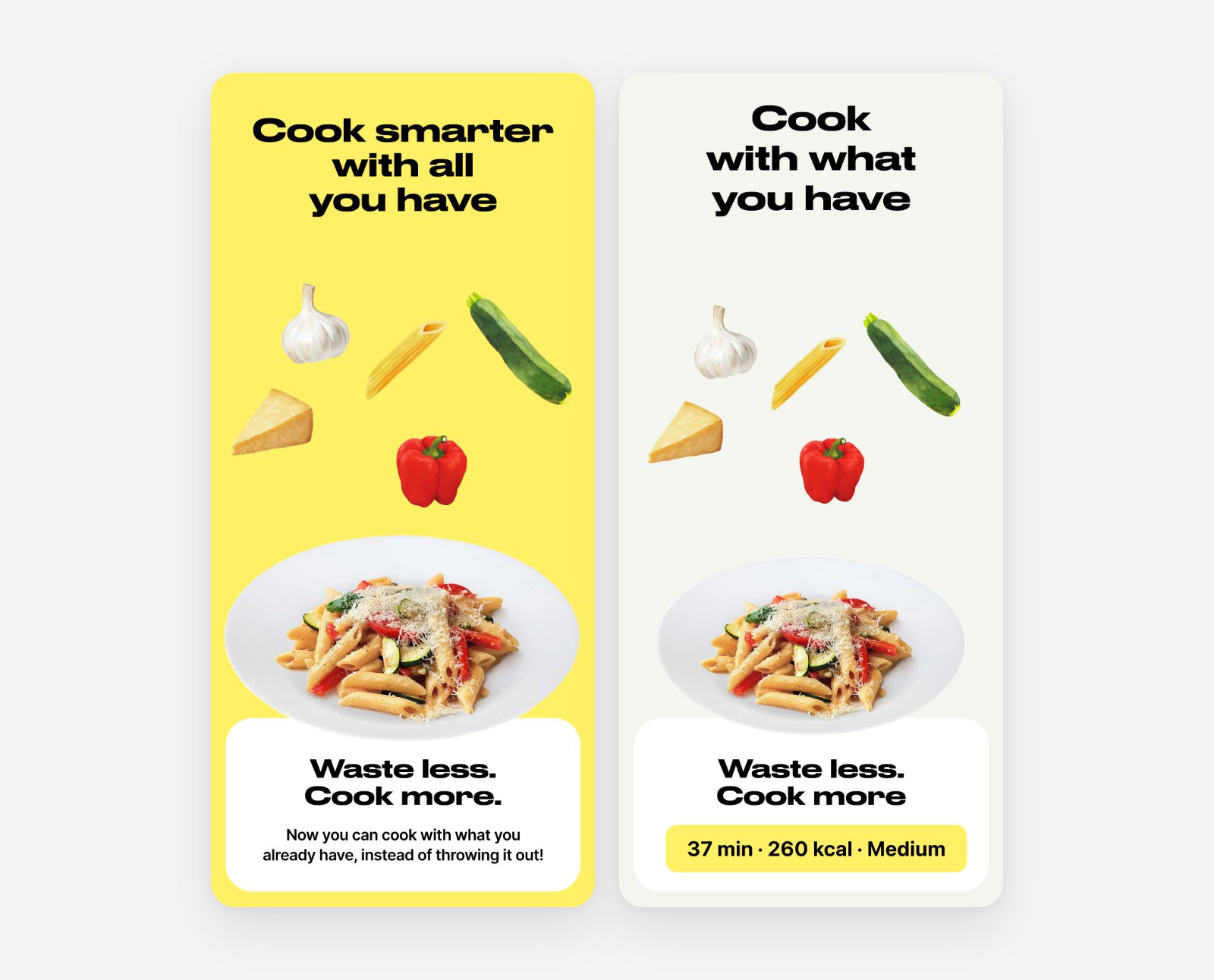
The store screenshots show how the system matured. The first set in July used a bright background on every slide, yellow and pink. By September the backgrounds went neutral and the headlines carried the feature instead. Same ingredients, same plate, a calmer page. The product photo does the work; the colour no longer competes with it.
App Store screenshot design for a recipe app: July and September versions of the same slide
Finding the position: from recipe finder to food label scanner
Recipe apps are a crowded shelf. Samsung Food, SuperCook, SideChef, Flavorish and others already promise dinner from your fridge, and I went through their store pages market by market. On that shelf, "another recipe finder" was hard to tell apart. But our camera could already read text, and a label in a language you cannot read is a real problem when you shop abroad or buy imported food. Scanners like Yuka show that people do point their phones at packaging; none of the recipe apps started there.
So the positioning moved. "Mild Recipe Finder" became a scanner that reads and translates any label, compares products and still ends in a recipe. The pitch line became "Scan. Understand. Cook." In October the store name followed.
For a designer this kind of change is uncomfortable, because half of your screens were drawn for a different promise. The way through was the same rule as at the start: one promise, one path. The camera stayed the front door. What changed was what the camera is best at first.
The paywall nobody saw: subscription UX in a freemium app
After launch I went through the purchase funnel screen by screen and found the problem was not the price. Most people never reached the paywall at all. They scanned, got an answer and left happy, which is good for them and invisible for the business.
The fix was not to push harder. My rule for Mild is "not pushy", and it stayed. Instead:
on Android we removed the hard limit of three scans and let scanning and translation work freely;
on iOS a small counter shows how many free scans are left, so the limit is never a surprise;
the paywall text now depends on where you came from, so it talks about the thing you were just doing.
A paywall is a screen like any other. If people do not see it, it needs the same care as onboarding: where does it appear, what does it say, and does it answer the question the person has at that moment.
Shipping to the whole world at once: localization and ASO
Mild went out on 22 September 2026 in 161 territories, after a pre-order period. The interface speaks 18 languages and the store listing has 50 localisations. The app also has an iPad layout and an Android version, so the same system had to hold on a phone, a tablet and a 4K Play Store screenshot.
Mild on iPad and Google Play: Android and tablet app design
Localising store pages is design work too. A headline that fits in English breaks in German, and a feature that sells in one market means nothing in another. Every locale got its own keywords, researched separately, instead of a translation of the English page.
What I would keep
Start from one promise and protect it. It made the pivot possible, because we could swap the promise without redrawing everything around it.
Go native where the core moment lives. For a camera app that is the first second after the shutter.
Read the funnel before you redesign a screen. The paywall problem looked like a price problem until the numbers showed nobody was getting there.
Let the product photo carry the store page. Colour is for actions, not for decoration.
Mild is live on the App Store and Google Play, and it keeps changing. If you are building a camera-first mobile app, a food or health app, or reshaping a product after launch and need a product designer, I am glad to talk it through.
 Taras Migulko · Product Designer & Product Owner