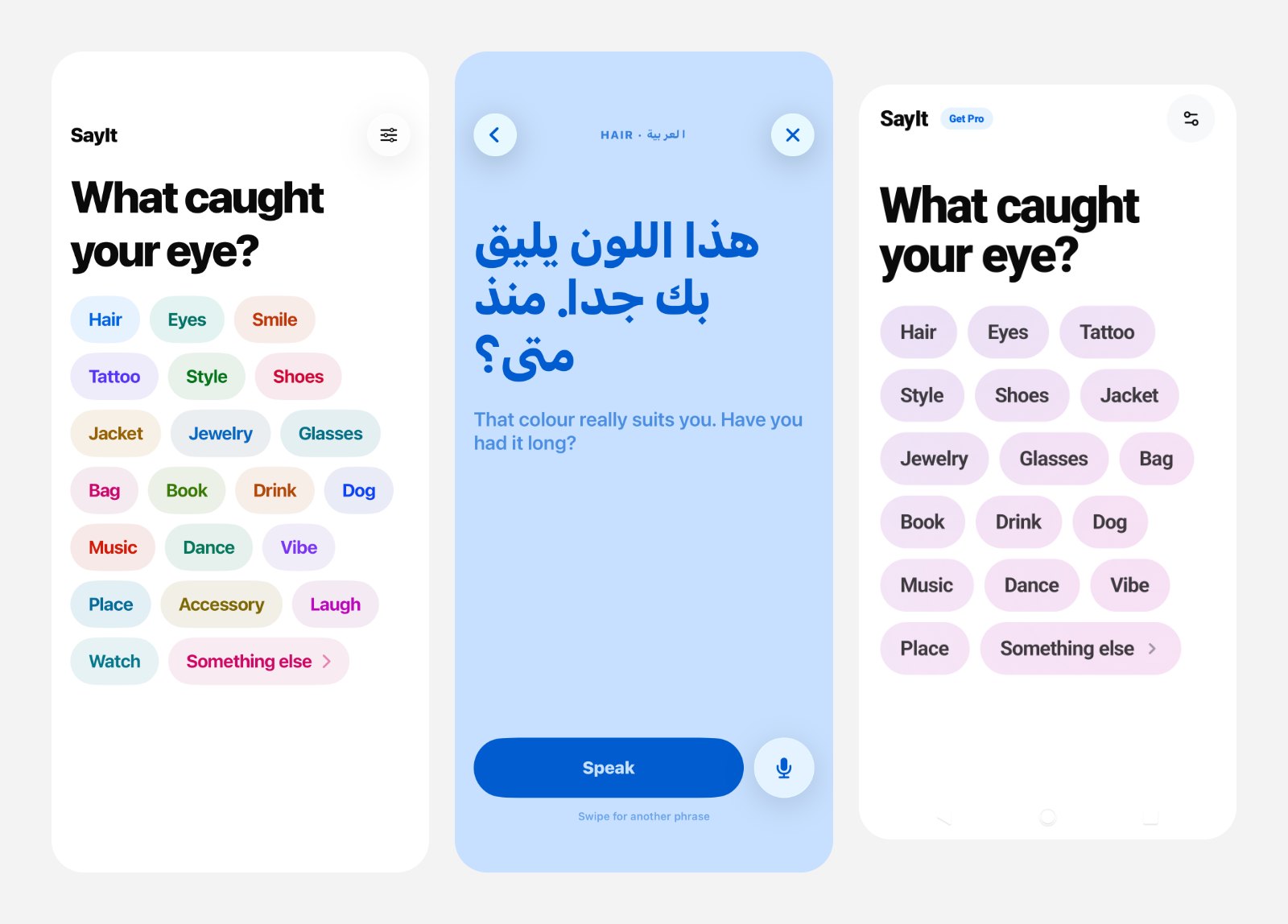
Mobile app design case study: SayIt, an offline conversation starter and compliment app that helps you talk to strangers in 36 languages, with zero typing.
Taras Migulko · Product Designer & Product Owner
You notice someone on a train, in a café, at a gallery. You would like to say something kind, and nothing comes. Or something comes, but you do not share a language. SayIt is a small tool for that moment: you tap what you noticed, choose their language, and the phone gives you a line and can say it out loud. You never type a word.
The README puts it in three lines I still like: not a dating app, not a chat app, not a chatbot. A tool. In store terms it is a conversation starter app and compliment app with offline translation, for talking to strangers face to face. This mobile app design case study covers the rules, the UX decisions and the localization behind it.
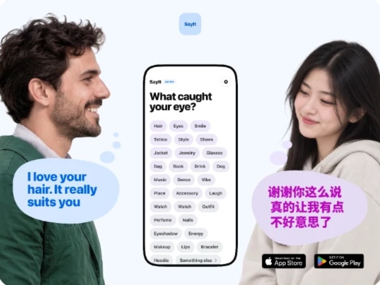
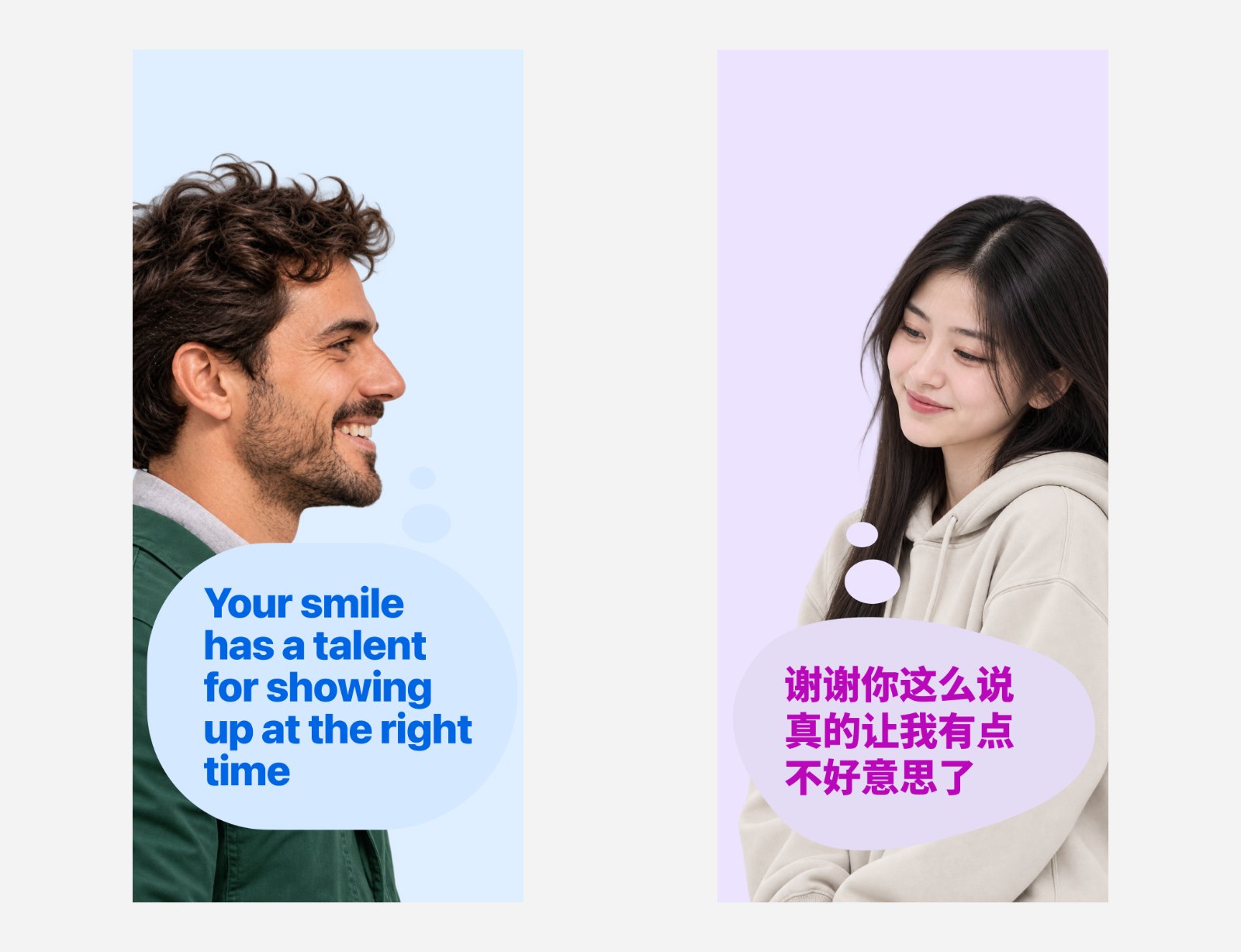
SayIt conversation starter app: a compliment and a reply translated into another language
What SayIt does: an icebreaker app in four taps
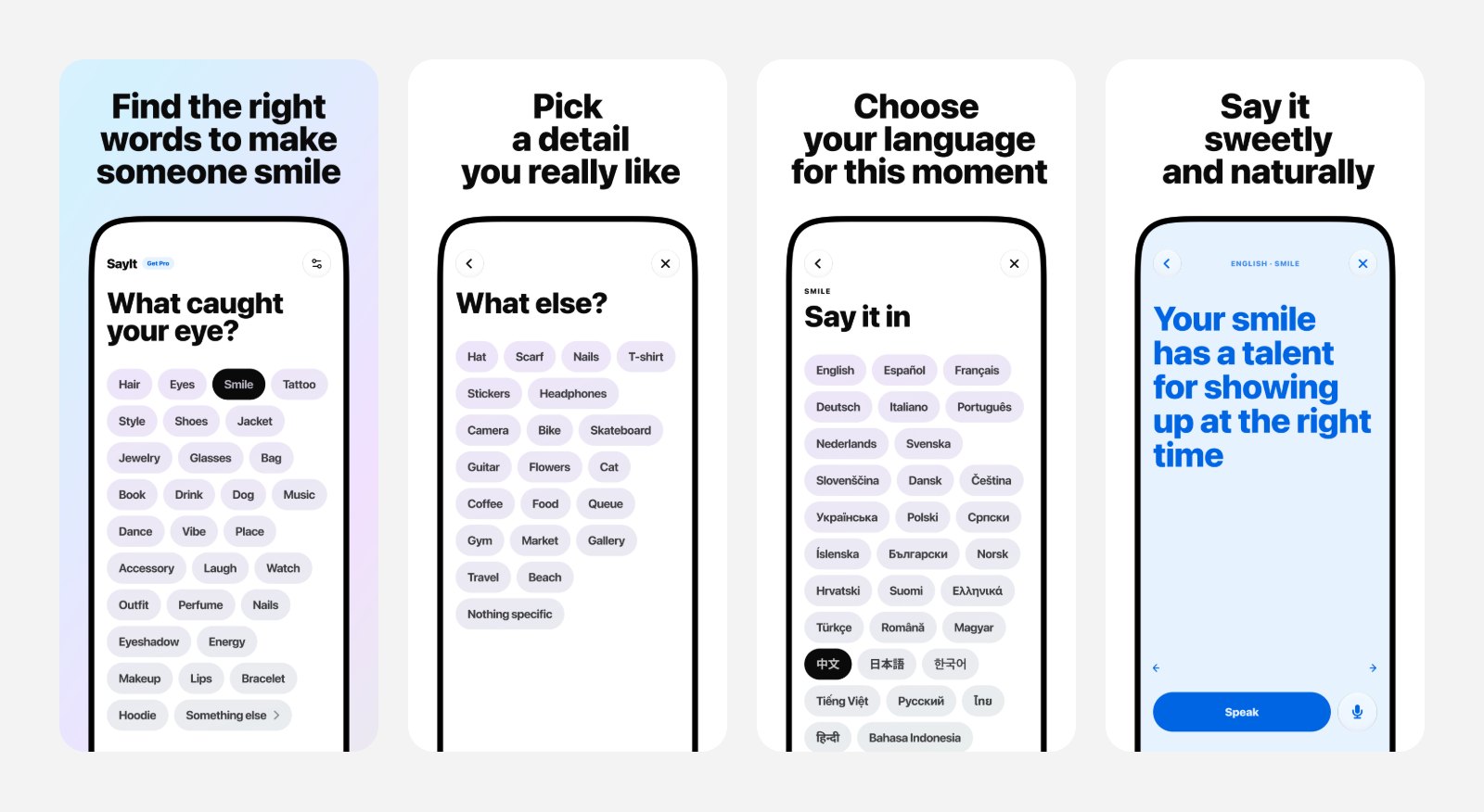
The whole app is four taps:
What caught your eye? Pick a tag: hair, eyes, smile, style, a book, a dog, music. If none fits, "Something else" opens a second page of tags.
Choose a detail you really like.
Choose their language. The phrase can be in any of 36 languages.
Say it. The app shows one warm, ready line with its meaning in your language. Press Speak and the phone says it out loud with a natural voice.
When they answer, press the microphone. SayIt listens and shows you what they said in your language, so the conversation can go on.
Most of it works offline: the phrases are written in advance and stored in the app. The free version includes five translations and five cloud-voice plays.
SayIt App Store screenshots: what caught your eye, details, language, the phrase
UX rules before screens: zero typing, offline first
Before drawing anything I wrote down the rules the product could not break. They did more design work than any mockup:
Zero typing, anywhere. If you are standing in front of a person, a keyboard is a dead end. Even "something else" is a second page of tags, not a text field, because a typo there ends the moment.
Offline first. The conversation happens in a metro or abroad, often without a signal.
No AI between your tap and the phrase. Every line is written and checked in advance. A generated sentence can be wrong in a way you only discover when the other person stops smiling.
No more than 22 categories on the home screen. This one is enforced by the build itself: add a 23rd and the app does not compile.
The rules also decided the type. A phrase is always shown at one fixed size, large enough to read in a hurry. That turned typography into a content limit: every line has to fit in 68 characters, 30 for Chinese, Japanese and Korean.
From SayHi to App Review in two and a half weeks
The working name was SayHi. On 18 September 2026 there were product docs, a content library and a web prototype. The next day the native iOS app was running on a phone, with Liquid Glass controls, an icon and a paywall. By 22 September the phrases were in 36 languages, and on 4 October the app went to App Review.
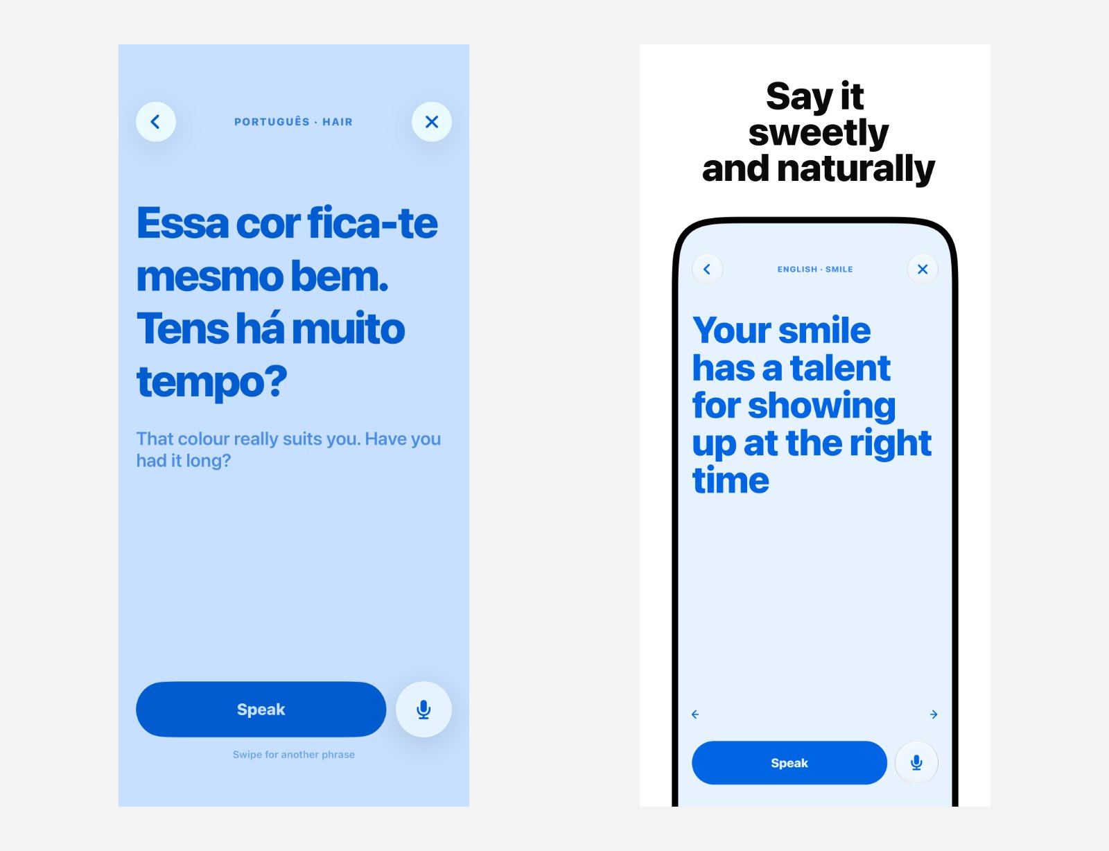
The first native build on 20 September, and the phrase screen today
The early build was all blue: the phrase in Portuguese, the English meaning below it. The idea was right; the screen was not finished. Comparing the two shows most of the design decisions in one glance.
Interface design: removing things until the button was big enough
An early palette was colourful and playful. It went quickly. In my own notes it is "too childish, too girly", and the first audience was men. The product settled on one brand blue, #368FFF, and very little else.
A gradient on the "Something else" button came in twice and was removed twice. The ‹ › buttons for flipping between phrases went too. Without them the Speak button grew from 115 to 249 points. That is the main action in the app, the one you press with a shaking thumb, and now it is impossible to miss.
Early iOS and Android app screens: categories, the Arabic right-to-left layout, Android
Right-to-left languages were part of the work from the start. Arabic is not a translation of the English screen; the whole layout mirrors, and every screen has to hold that.
Content design: fewer phrases, better phrases in 36 languages
The content went through four versions. It started with 125 phrases, all of which were rewritten in a single day. Then came a set of compliments ending with "What's your name?", then 950 phrases. The current library is smaller: 48 categories with 10 phrases each, 480 in total, with no question tacked on the end.
Cutting from 950 to 480 was the right call. More options make the choice harder exactly when you have no time. Each phrase now does one job and does it in a tone that is warm, not pushy. Across 36 languages that is 17,280 strings, and review by native speakers is the part I am still finishing.
App Store localization in 35 languages
The App Store page has ten screenshots, made in Figma, in each of 35 languages: 350 images, each with a headline written for that language rather than translated word for word. Keywords that promised dating, matching or live translation were left out on purpose. They would bring the wrong people and break the promise of the first screen.
App Review pushed back once, on age assurance. SayIt is for people 16 and older, and the age declaration needed to say so precisely. After that was fixed, version 1.0 was approved.
What I would keep
Write the rules first. "Zero typing" and "22 categories" settled more arguments than any review.
Let constraints shape the type. One fixed size made the content better, not just the layout.
Remove until the main action is obvious. Every element taken away made the Speak button stronger.
Fewer, better options win in a hurry. 480 good lines beat 950 average ones.
SayIt is approved for the App Store and on its way to Google Play. If you are designing a mobile app for a moment where people have seconds, not minutes, and need a product designer, I would be glad to compare notes.
 Taras Migulko · Product Designer & Product Owner