Then: designing a voice planner app and AI calendar
Product design case study: Then, a voice assistant that turns speech into tasks, calendar events and reminders on iPhone, iPad, Mac and Apple Watch.
Taras Migulko · Product Designer & Product Owner
Every calendar I have used asks the same thing before it helps: pick a section, fill in the fields, choose a time. Then starts from the other end. You say what you intend to do, in your own words, and the app turns it into a plan. Its line on the store is "Say it now. Do it Then."
Then is a voice planner app and AI calendar: a voice assistant that creates tasks, calendar events and reminders from what you say. This product design case study shows how it went from a single HTML prototype to an app on iPhone, iPad, Mac and Apple Watch, and what the App Review process taught me along the way.
A calendar you speak to: voice to calendar, without forms
Then is for a busy person who catches commitments on the move: in a corridor, in a taxi, between two calls. Typing an event with a start time and a location at that moment is exactly what nobody does. Saying "lunch with Anna at Café Savoy at one, then send Maria the proposal" takes four seconds.
The app shows everything on one timeline: meetings, emails to send, Telegram, WhatsApp and Slack messages, voice notes. Each kind has its own colour, so you read the day at a glance without labels.
Behind it is a simple loop: voice, understand, confirm, action. That third step matters most. The AI suggests what to do; it does not send an email or change your calendar on its own. A draft message stays a draft until you say so, and the app checks every action before it happens. A planner you cannot trust with your outbox is worse than no planner.
What Then does: a voice assistant that creates your tasks and events
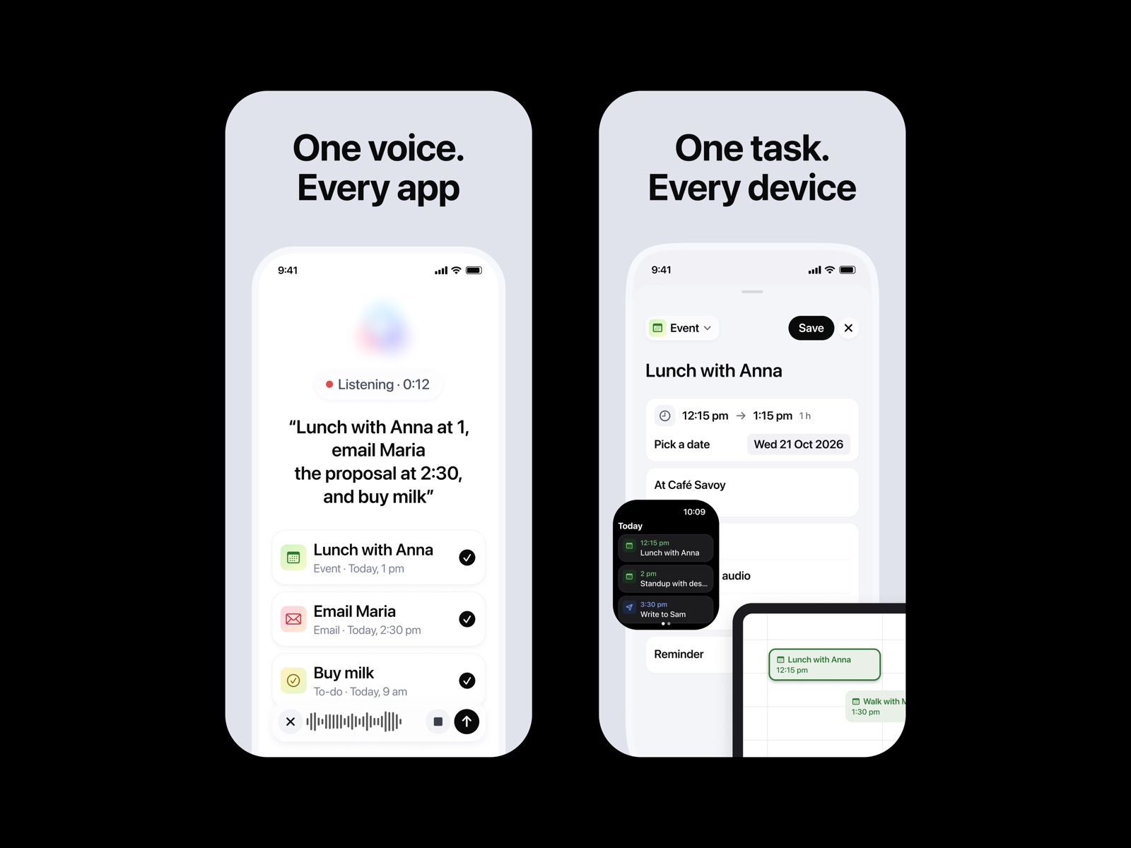
You tap the microphone and say what you need. Then turns it into a draft, shows a short preview, and creates the item only after you confirm by voice or with a tap. Three things you can say:
"Tomorrow at 10, meeting with Alex." A calendar event with the title, date and time filled in. The editor keeps the rest within reach: from-to time, description, link, a reminder, an audio note or a photo.
"Tomorrow at 12, email Sarah that the homepage is ready." A draft email to Sarah. The app finds her in your contacts only after you allow it, shows the address so you can confirm, and sends at noon. Nothing is sent just because the AI suggested it, and Then never reads your inbox; it asks only for permission to send.
"Tomorrow at 3, save a voice message." Then records your voice and reminds you at three, with your original recording one tap away.
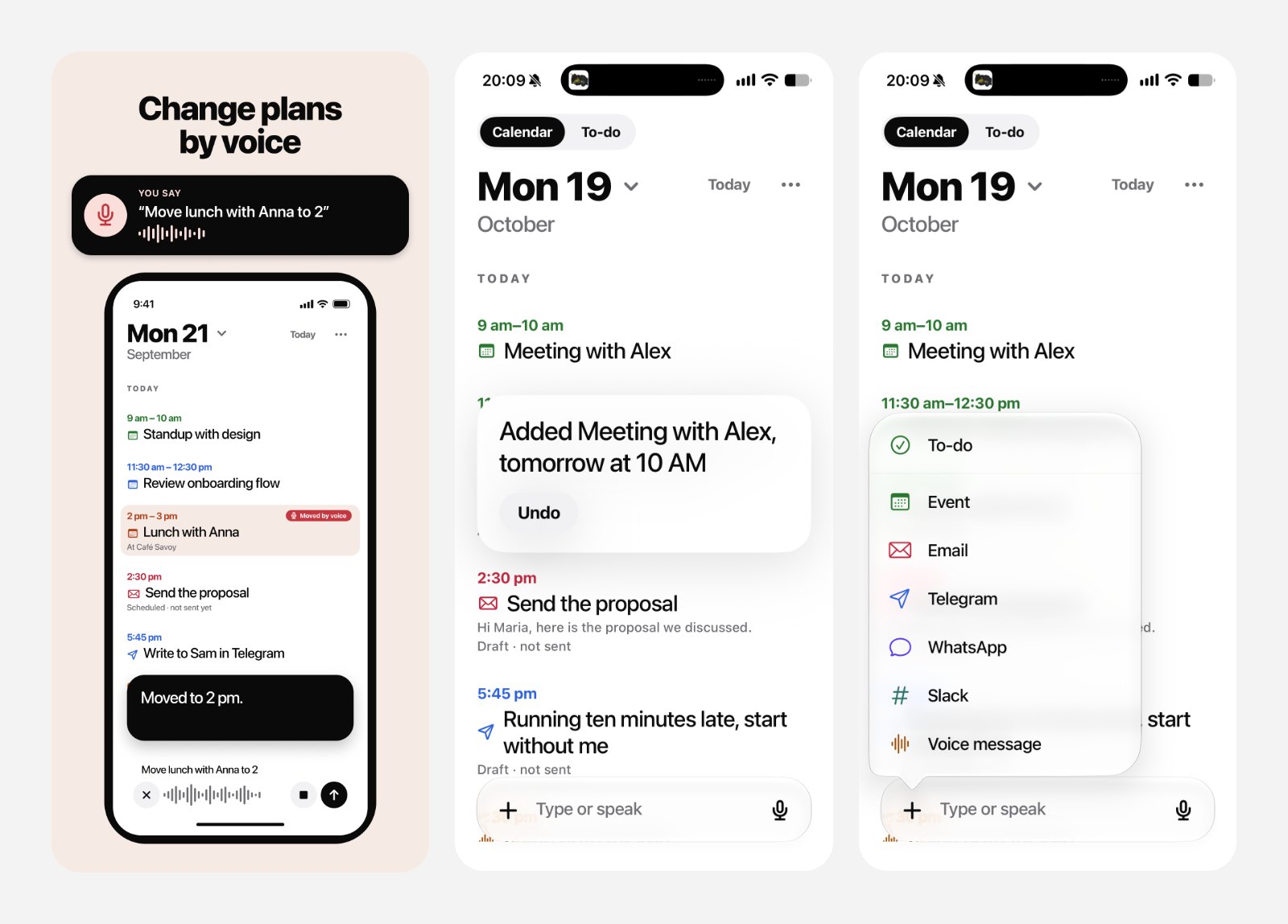
The best part is that you can keep talking. If you say "make it three" after creating a meeting, the app moves that meeting to three instead of creating a new one. When something is genuinely missing, a time or which of two Sarahs you mean, it asks one short question. Otherwise it does not ask at all.
Replies come as text by default; you can switch on a spoken voice in settings. Everything lands on one timeline: meetings, emails, Telegram, WhatsApp and Slack messages and voice notes, each in its own colour.
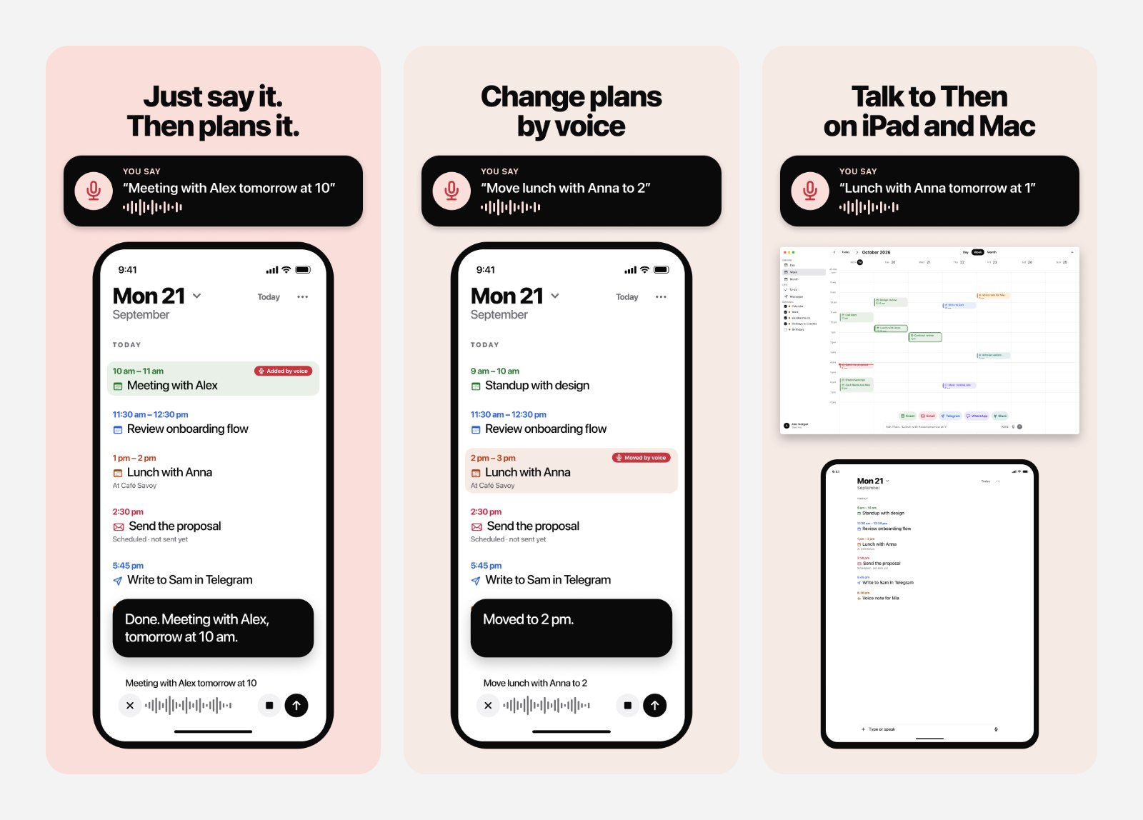
Voice task manager: changing plans by voice, the AI planner's answer, and the kinds of tasks you can add
From an HTML prototype to a native iOS app
The whole product started as one HTML file: a clickable prototype of the day view, the recording sheet and the planner's answer. On 20 September 2026 the native app was built from it, and the repository's first commit says exactly that.
A prototype is a promise, not a spec, and some parts did not survive contact with a phone. Dragging an event to a new time worked with a mouse in the prototype. On a touch screen it became a long press with 15-minute snapping, because a finger is not precise and nobody plans a meeting for 14:07. Every difference like that was written down in a short delta file, so design and code never drifted silently.
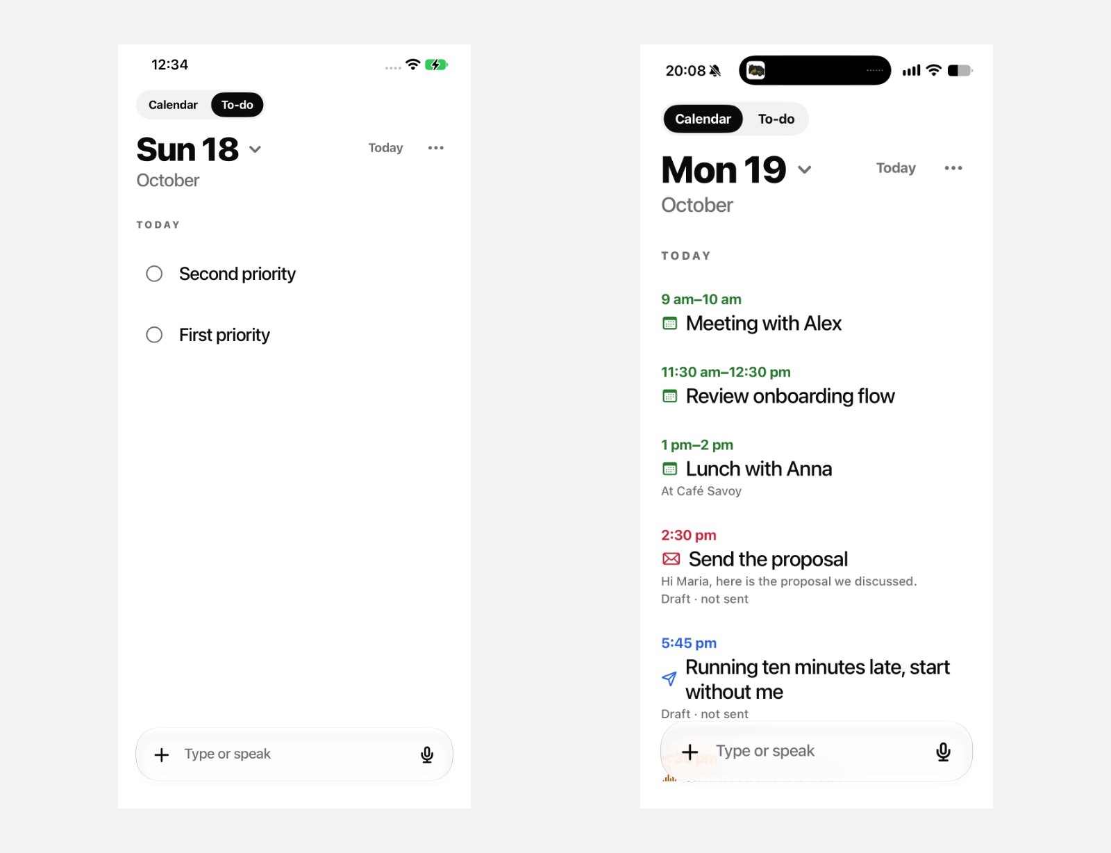
The first real build on 18 October and the version a day later
The first real screens were rough: two test items on an empty day. A day later the same screen showed a real plan with meetings, a draft email and a message, which is when it started to feel like the product in the prototype.
App icon design: one colour for the icon
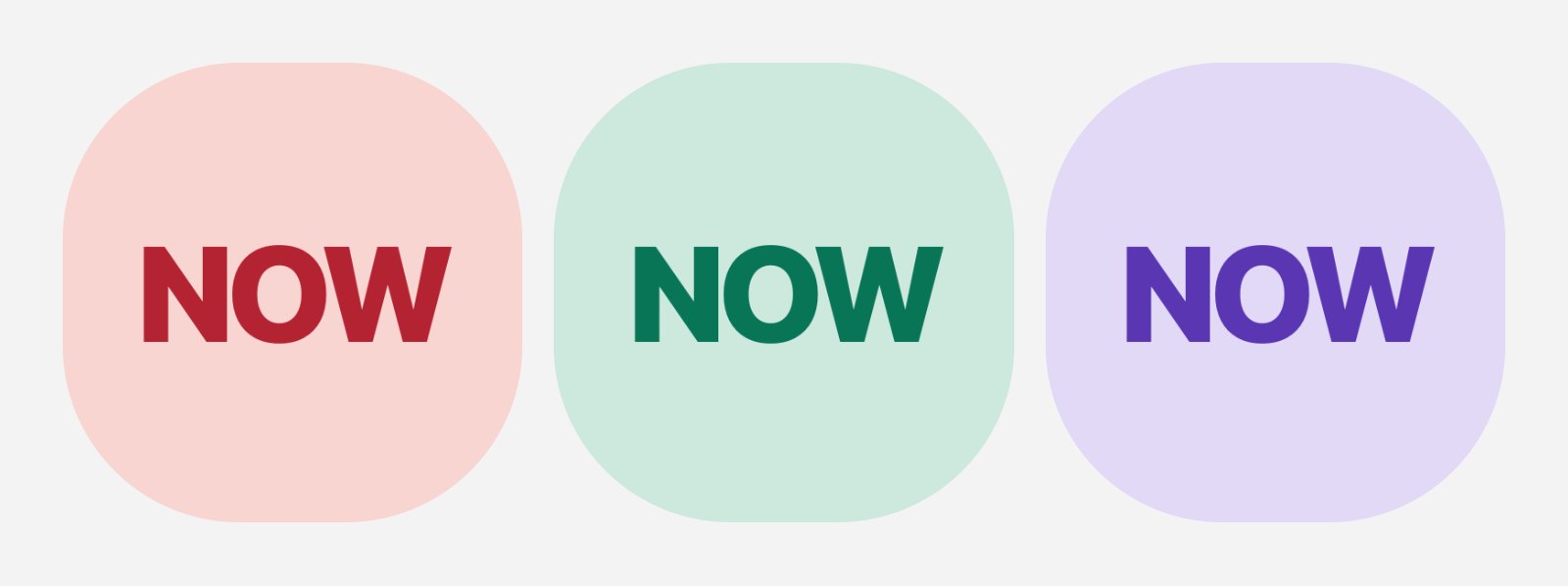
Then has a sibling app, SayIt, whose brand is blue. On a home screen two apps from the same designer should not look like a pair of twins. I tested three colours for the icon: coral, mint and lilac. Coral won. It has a contrast of 4.78:1 for the white mark on top, it reads as warm and active, and it is clearly not SayIt's blue.
App icon design colour study for Then: coral, mint and lilac
The same day on every screen: iPhone, iPad, Mac and Apple Watch
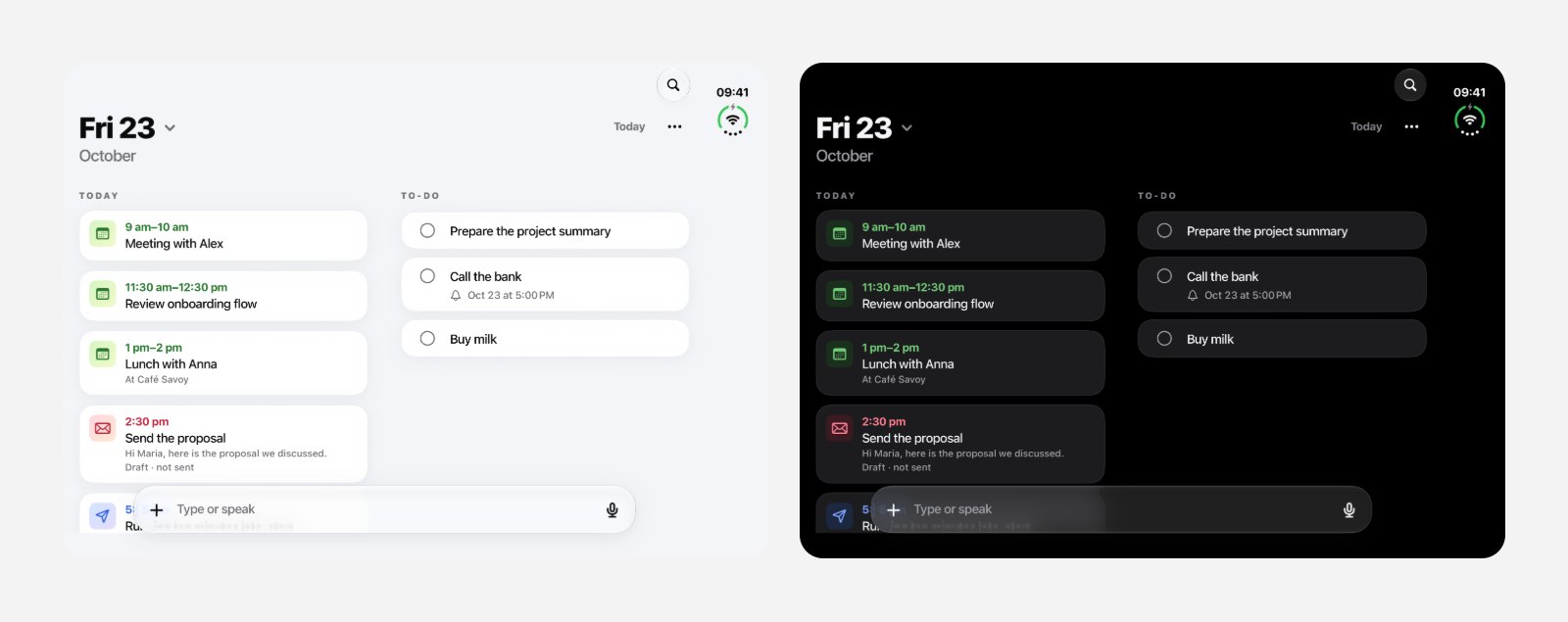
A plan you make by voice on the phone has to be there when you sit down at the Mac. Then runs natively on iPhone and iPad, on the Mac and on Apple Watch, and syncs between them. On a wide screen the day and the week sit side by side; on the Watch you see what is next.
Then productivity app on a wide screen in light and dark mode
The App Store screenshots are real app screens, captured by UI tests rather than drawn as mockups. That keeps the store honest: what you see on the page is what opens on your phone.
App Store screenshots of the Then voice planner app
What App Review taught me: account deletion in iOS apps
Then went to Apple with metadata in 50 locales; the app itself speaks 40 languages. The first answer was a rejection, under guideline 5.1.1(v): if an app lets you create an account, it must let you delete it inside the app. We had deletion on the server, but not a button in the app.
It is a fair rule, and it is the kind of detail that falls through when a product moves fast. The fix took a day: a clear "Delete account" flow in settings, a confirmation, and real deletion on the server. Then went back to review with the new build on 6 November.
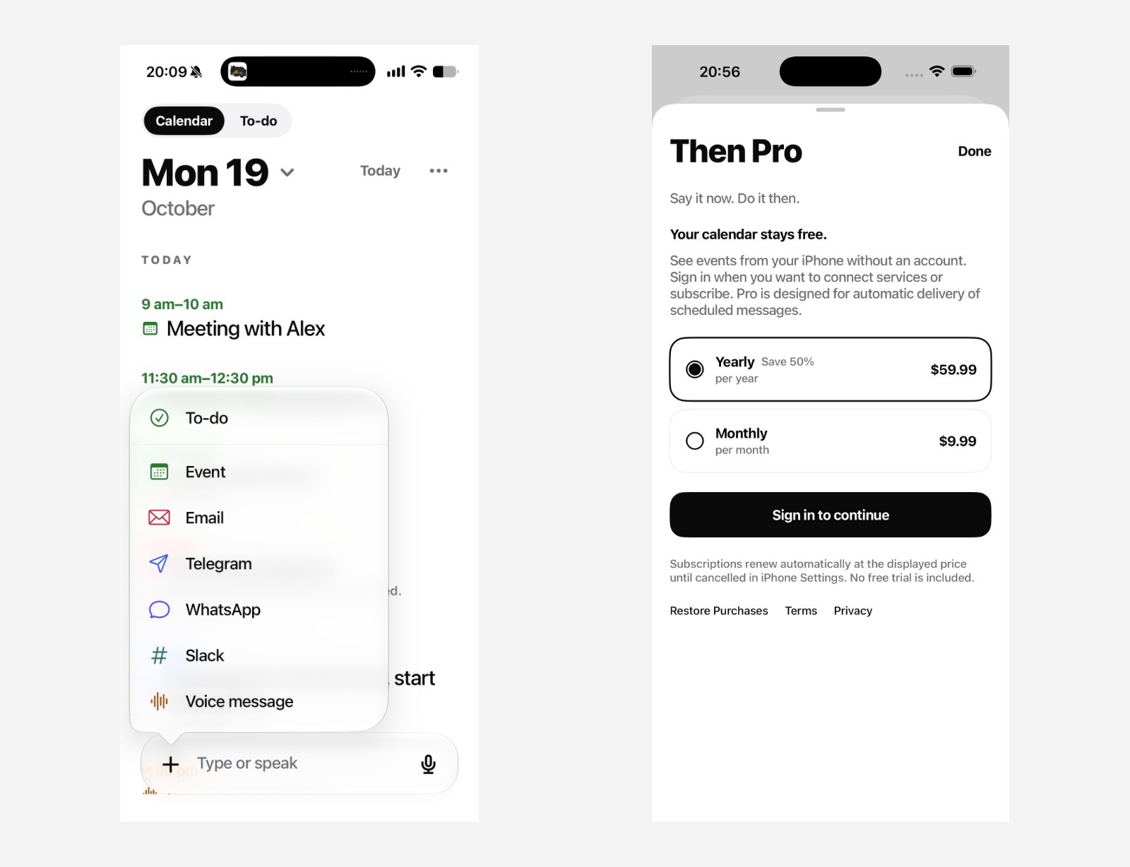
The add menu with the kinds of items, and the Then Pro paywall
App Store optimization: naming a voice planner
Store search is its own design problem. Keyword research showed that "Voice Assistant" in the title would put Then next to Siri and ChatGPT, a fight a small calendar cannot win. So the name and subtitle talk about planning your day by voice, which is what the app actually does better than a general assistant.
What I would keep
Start from intent, not from fields. People remember what they want to do, not which form it belongs in.
Let the AI propose and the person decide. Trust is a design feature.
Write down every gap between prototype and app. It is the cheapest way to keep design and code honest.
Ship real screens to the store. Mockups age; screenshots from the app do not lie.
Then is in App Review now. If you are building an AI product, a voice assistant or a productivity app where voice has to fit into someone's day without taking it over, and need a product designer, I am happy to talk.
 Taras Migulko · Product Designer & Product Owner